Visa Accept // The Microseller Experience
Enabling quick and seamless sales for microsellers through saved items
O V E R V I E W
Visa Accept enables anyone with a mobile device to accept card payments instantly, with no additional hardware required. While the experience was simple for casual sellers, microsellers with recurring sales, such as market vendors and hairdressers, encountered friction due to repetitive manual entry and the lack of item-level tracking.
Over five months, I led the end-to-end design of a Saved Items feature focused on improving selling efficiency for microsellers. Working closely with design, product, and engineering, I drove the feature from concept through testing, iteration, and successful release.
By reimagining the selling flow around saved items, we created a seamless, intuitive experience that empowers microsellers worldwide to participate confidently in the digital payments ecosystem.
-
Role
Feature Designer. Owned the entire design process for sale enhancement and collaborated closely with 5-person design team, product, and engineering to deliver a high-quality release.
-
Company & Type
Visa, Mobile SDK (Android & iOS)
-
Duration
June - September 2025 (4 months)
-
Tools
Figma, Microsoft CoPilot 365 Suite, Excel, Generative AI
T H E C H A L L E N G E
Optimizing selling for microsellers with recurring items
How might we enable microsellers to sell more efficiently instead of forcing them to rely on manual sale entry?
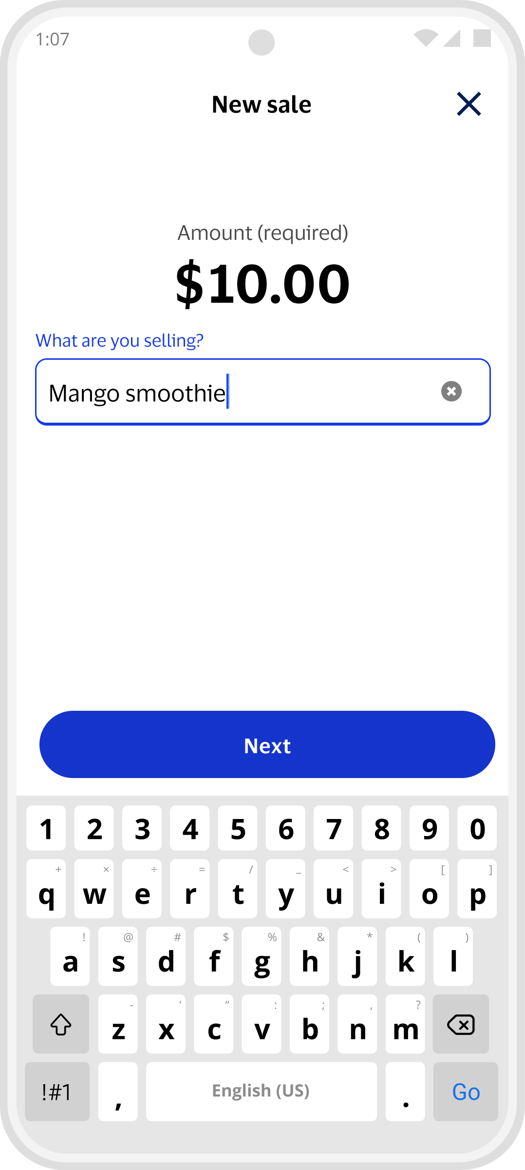
Original Design - New Sale
D I S C O V E R Y
Developing product and user understanding
Context
Visa Accept empowers sellers to accept card payments instantly on their mobile phones using their banking apps. With no additional hardware needed, sellers can accept tap-to-pay, QR, and pay-by-link payments with ease.
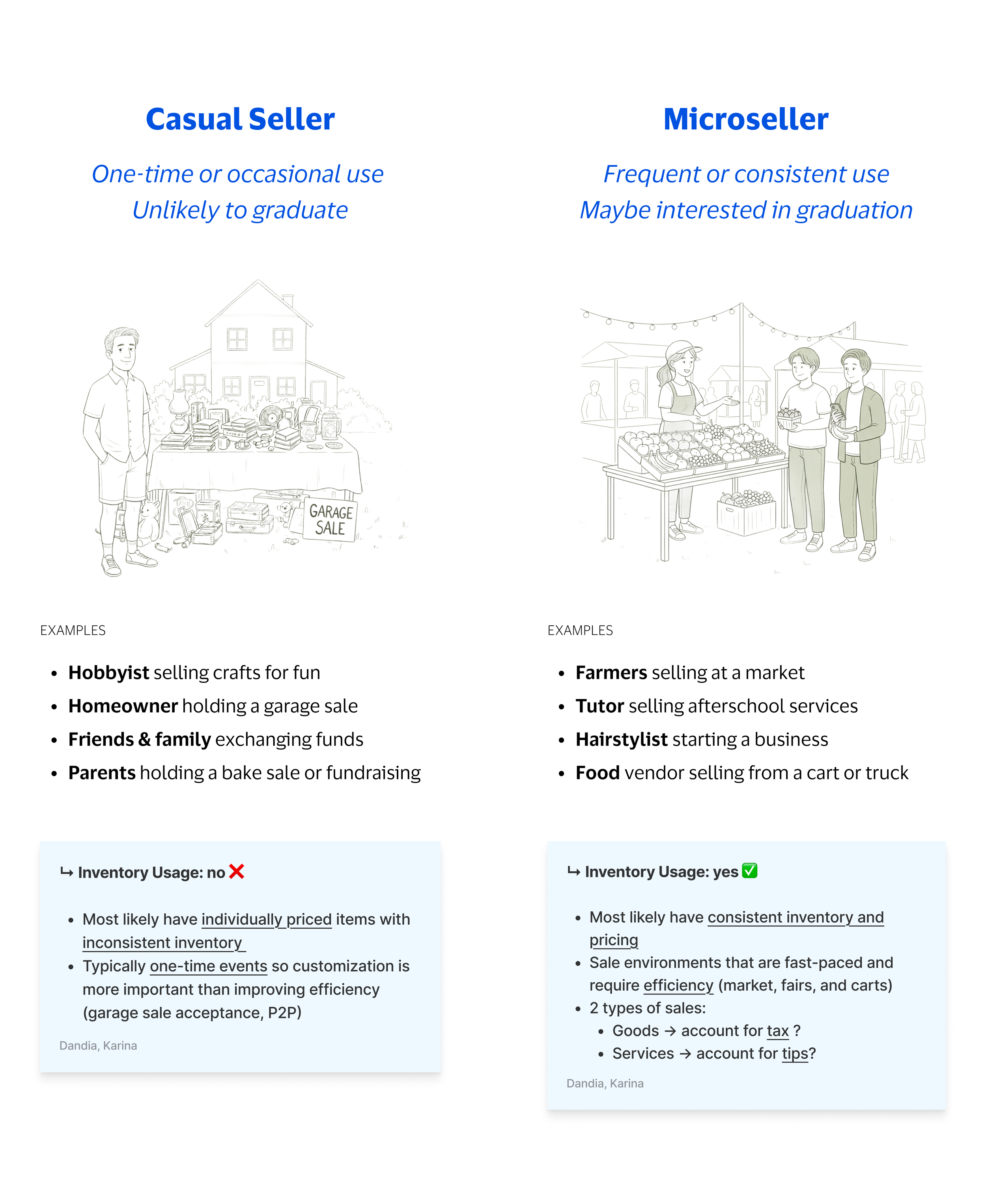
Users
Casual sellers are one-time or occasional users like a homeowner holding a garage sale or friends exchanging funds.
Microsellers have consistent usage such as a food vendor cart or a hairstylist starting a home business.
While casual sellers could sell with ease, microsellers lacked an efficient selling experience due to repetitive manual entry and the lack of item-based tracking.
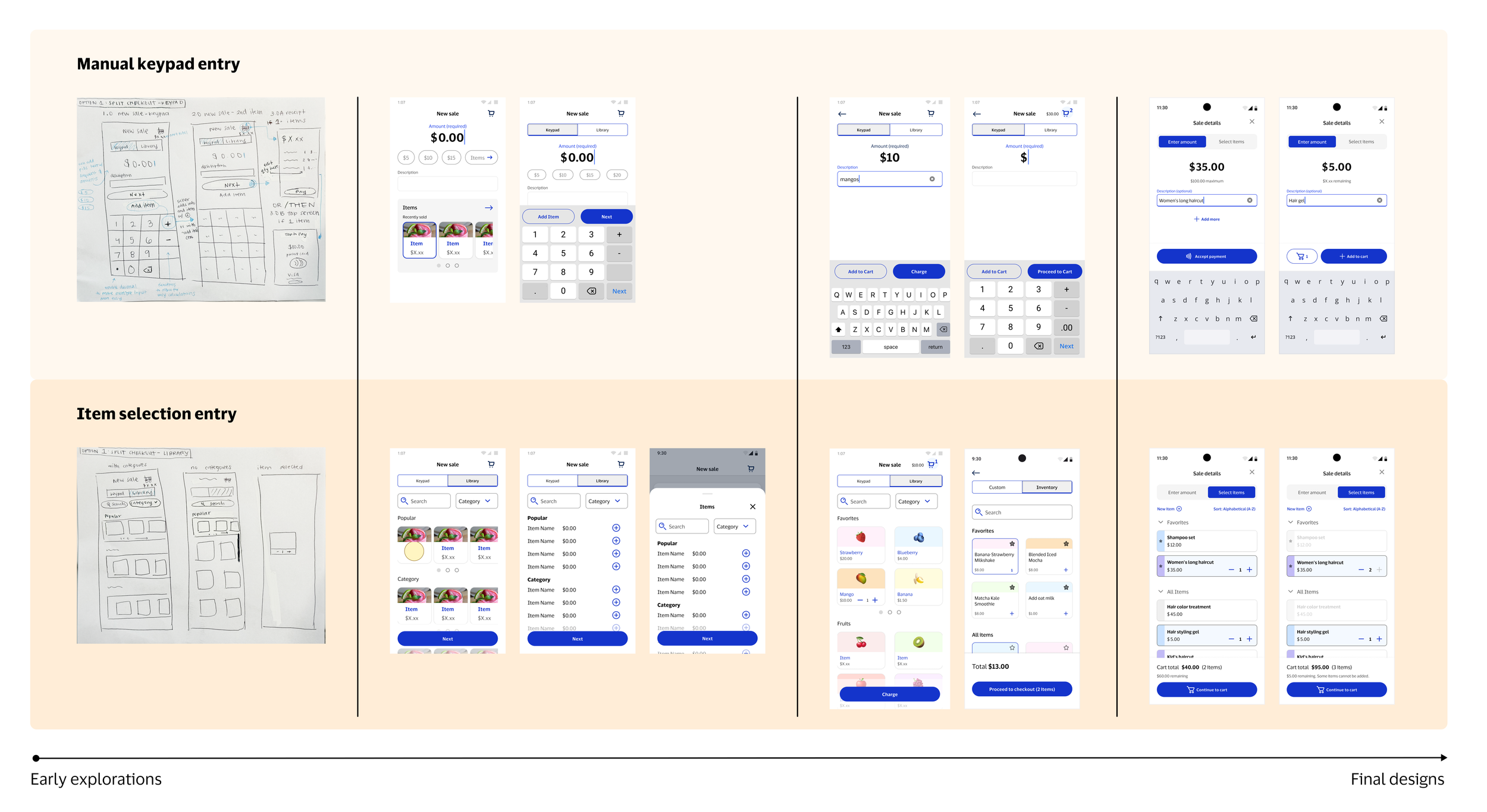
D E S I G N I T E R A T I O N
Design refinement through exploration, feedback, and testing
Wireframe Evolution 15+ iterations
Design iterations balancing user experience priorities and business realities:
User needs
Business goals
Technical feasibility
Stakeholder org changes
Usability Testing 2 tests
Working alongside the research team, we conducted 2 usability tests at different design stages: an early feature-specific check and a final release validation.
#1: Early feature testing:
💡 User confusion with toggle labels informed a change to more explicit, action-oriented language
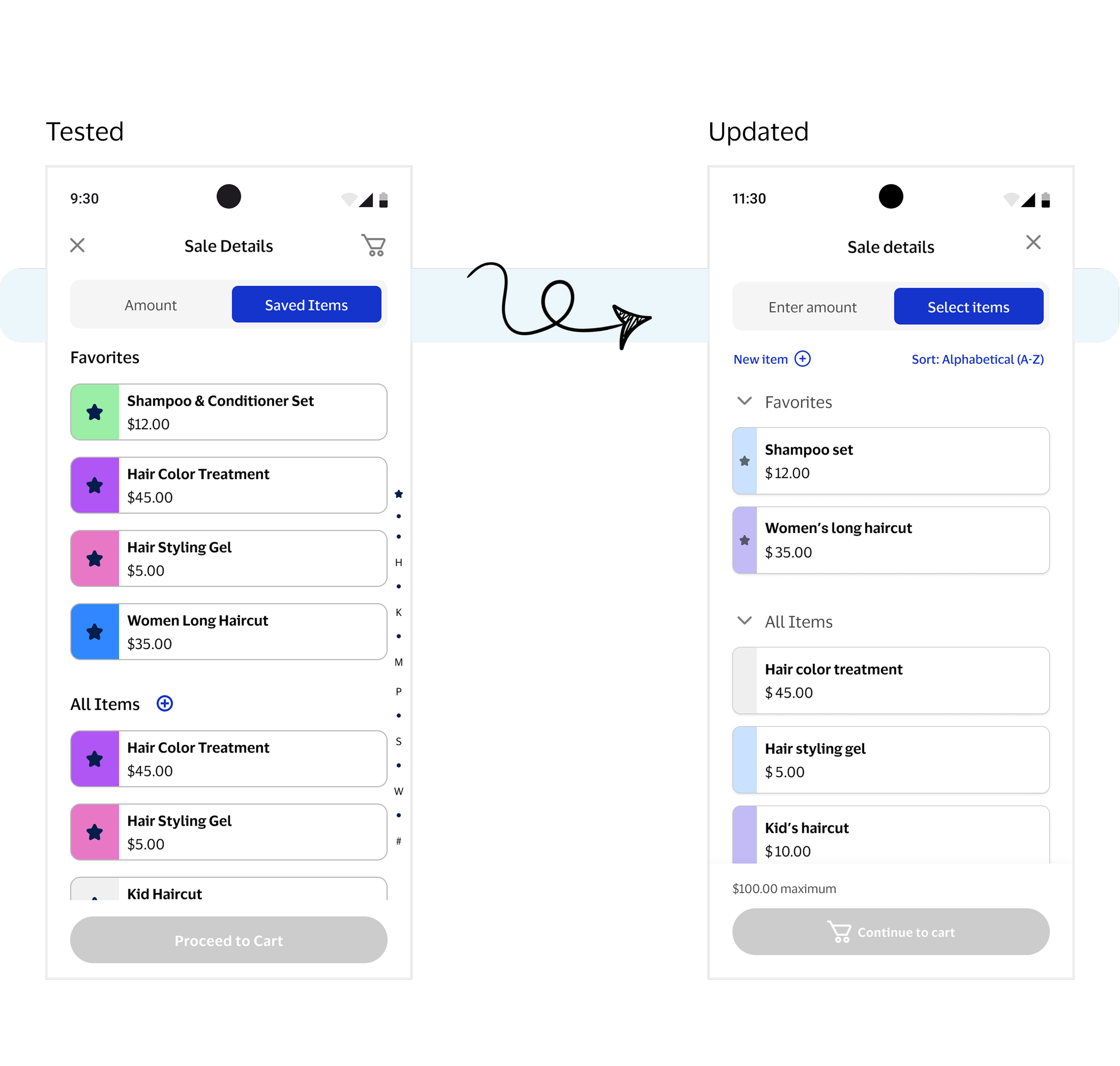
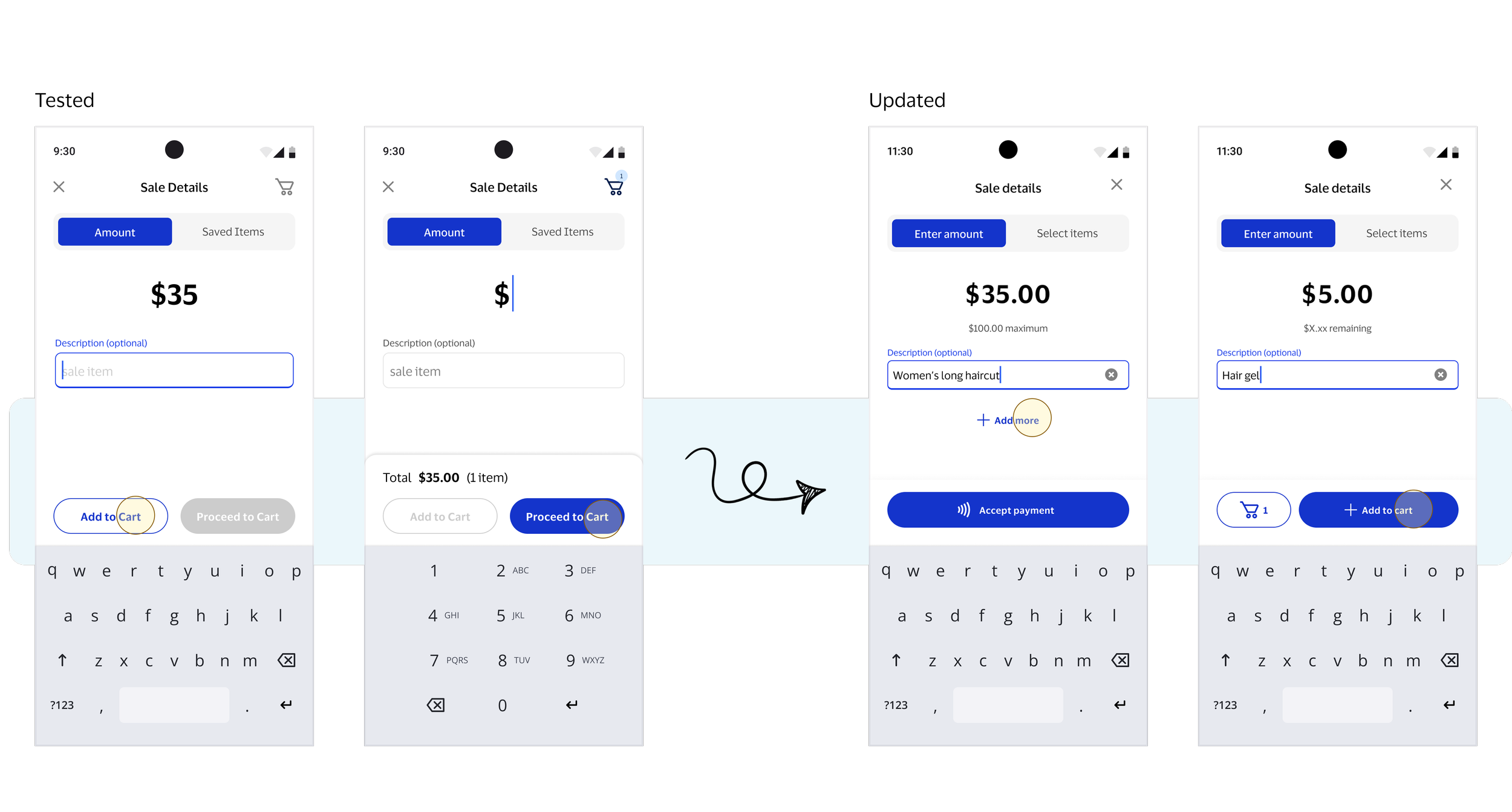
💡 Competing dual buttons created hesitation around how to proceed to checkout, prompting visual hierarchy and text change
#2: Final validation: Participants easily grasped the concept and found the experience enjoyable. Future enhancements like item categories and easier post-sale item creation were suggested.
K E Y D E S I G N D E C I S I O N S
6 pivotal design moments
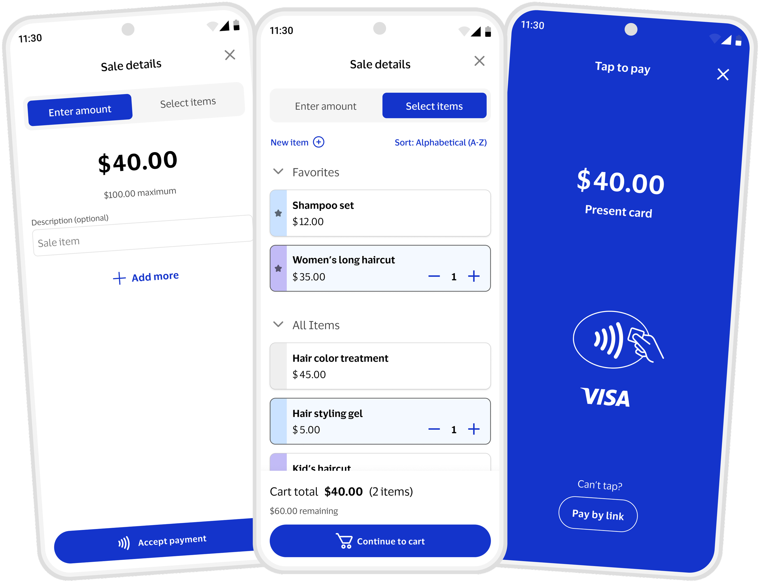
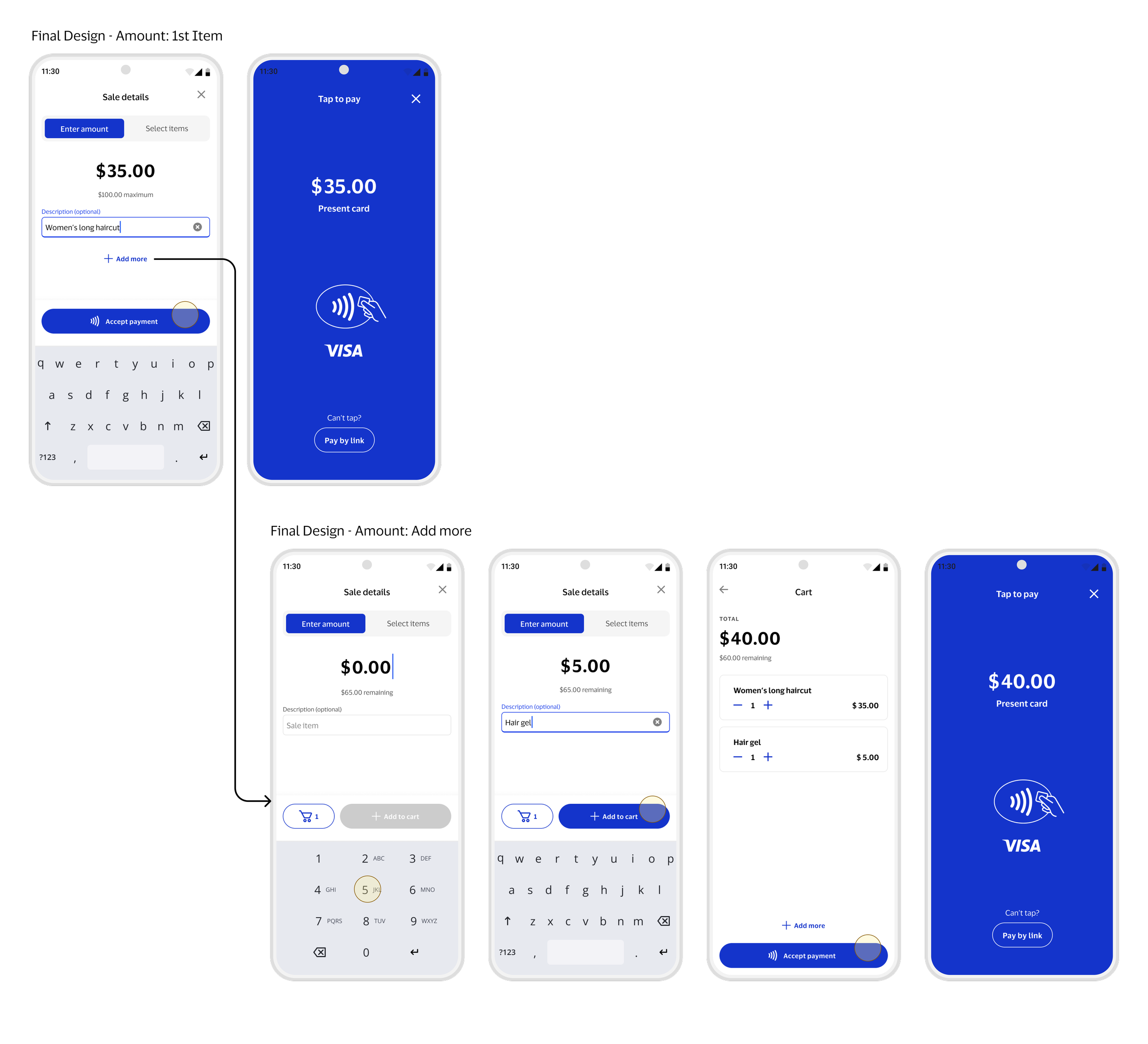
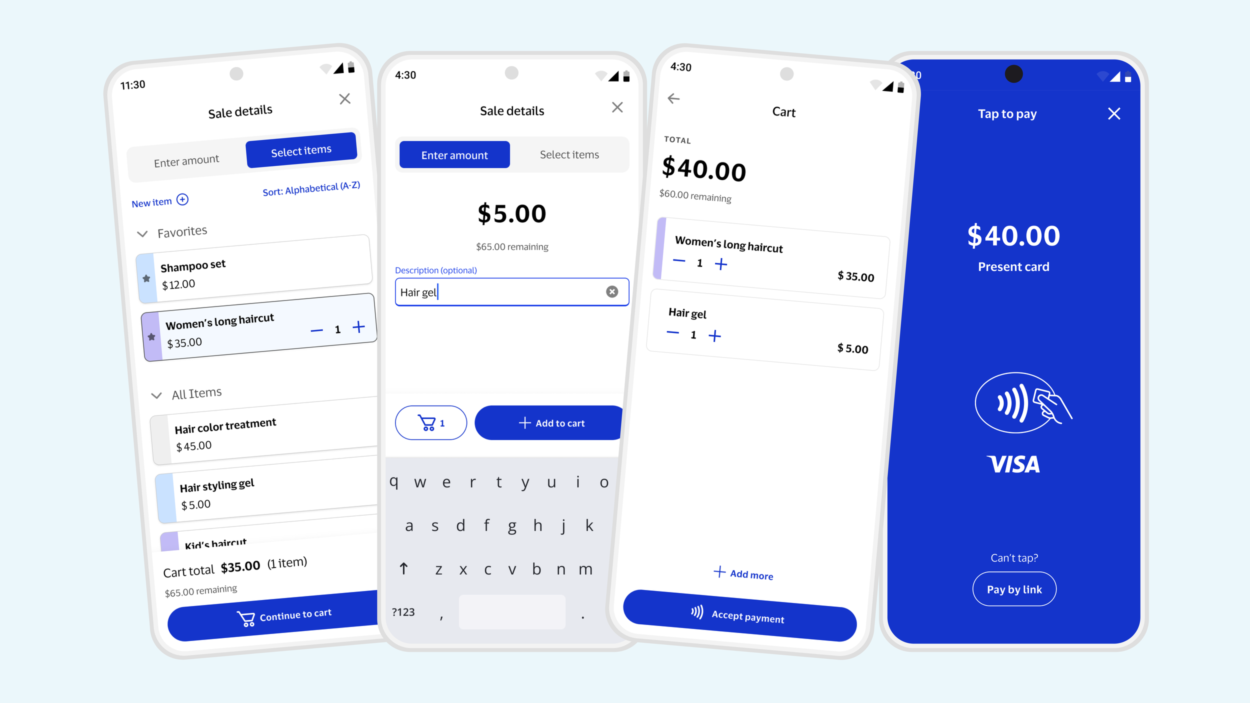
Flexible input: Toggle design supports adding to sale via amount entry and item selection.
Optimized experiences: Mode-specific pages allow focused, tailored interactions.
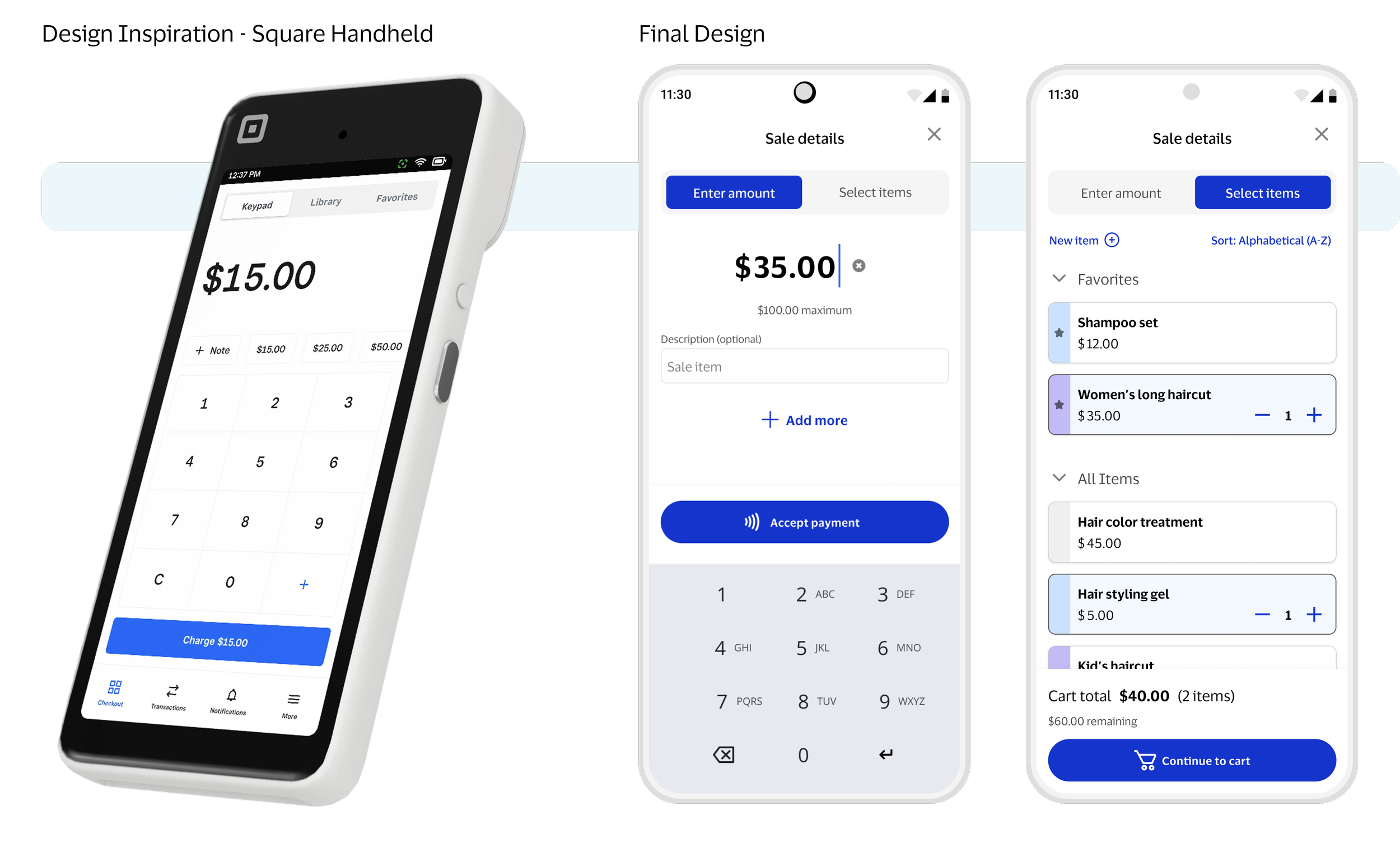
Industry-inspired: Design draws inspiration from POS software like Square and Toast.
1. Toggle Modes
Focused progression: A single primary action ensures users can easily advance through the mode-specific experience.
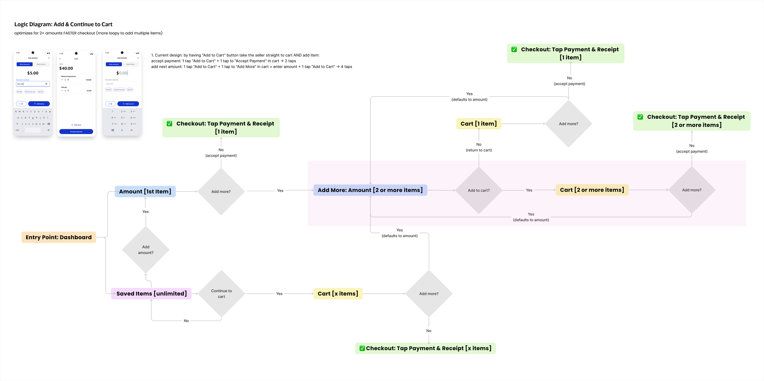
Add to cart optimization: Button that adds an item immediately takes sellers to the cart for faster checkout.
2. Buttons
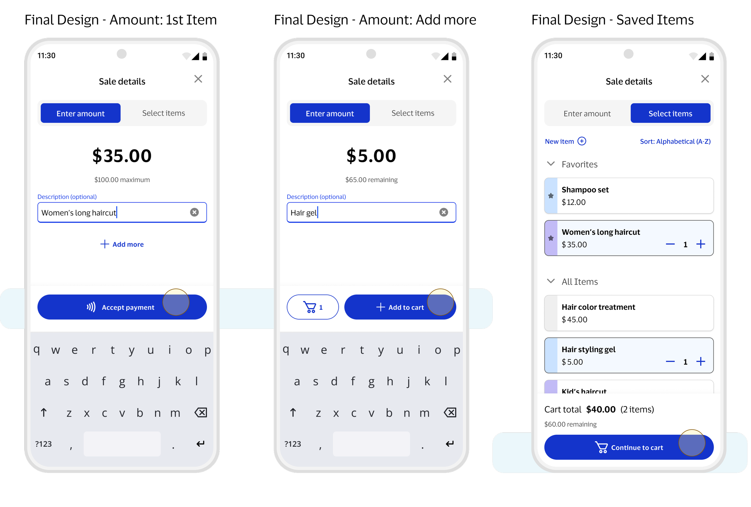
In-context guidance: Limits are surfaced during the sale for clarity and better understanding.
Simplified limits: Multiple sales limits condensed into a single maximum amount.
Dynamic feedback: Maximum amount updates to a remaining amount as users build their cart.
Error prevention: Buttons are disabled when limits are reached to prevent mistakes.
3. Sale Limits
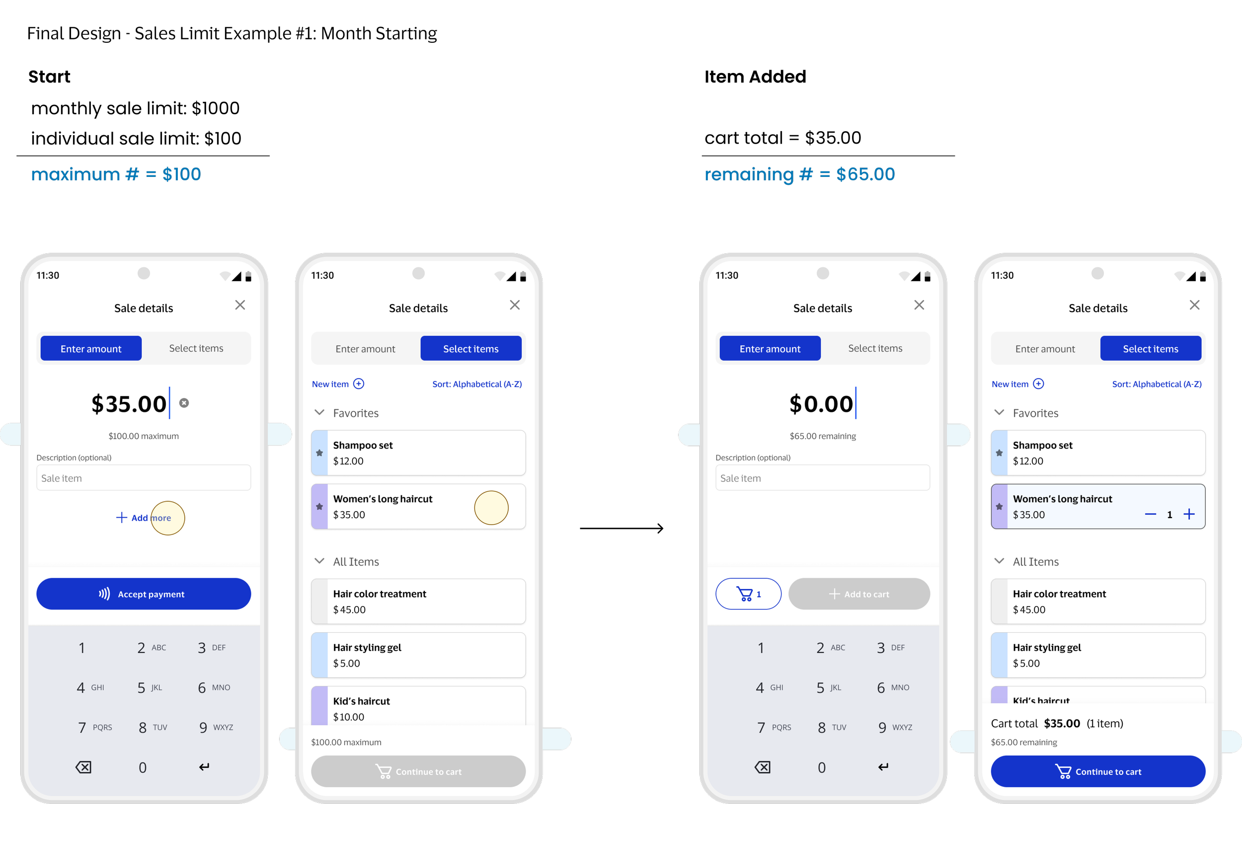
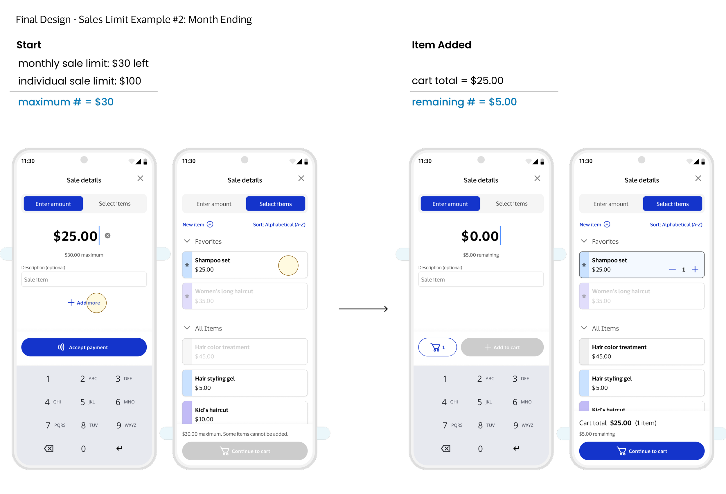
Only after a seller intentionally chooses to add more on Amount mode, the cart concept appears.
This optimizes sales for sellers with only 1 item while letting those with multiple items review before payment.
4. Cart
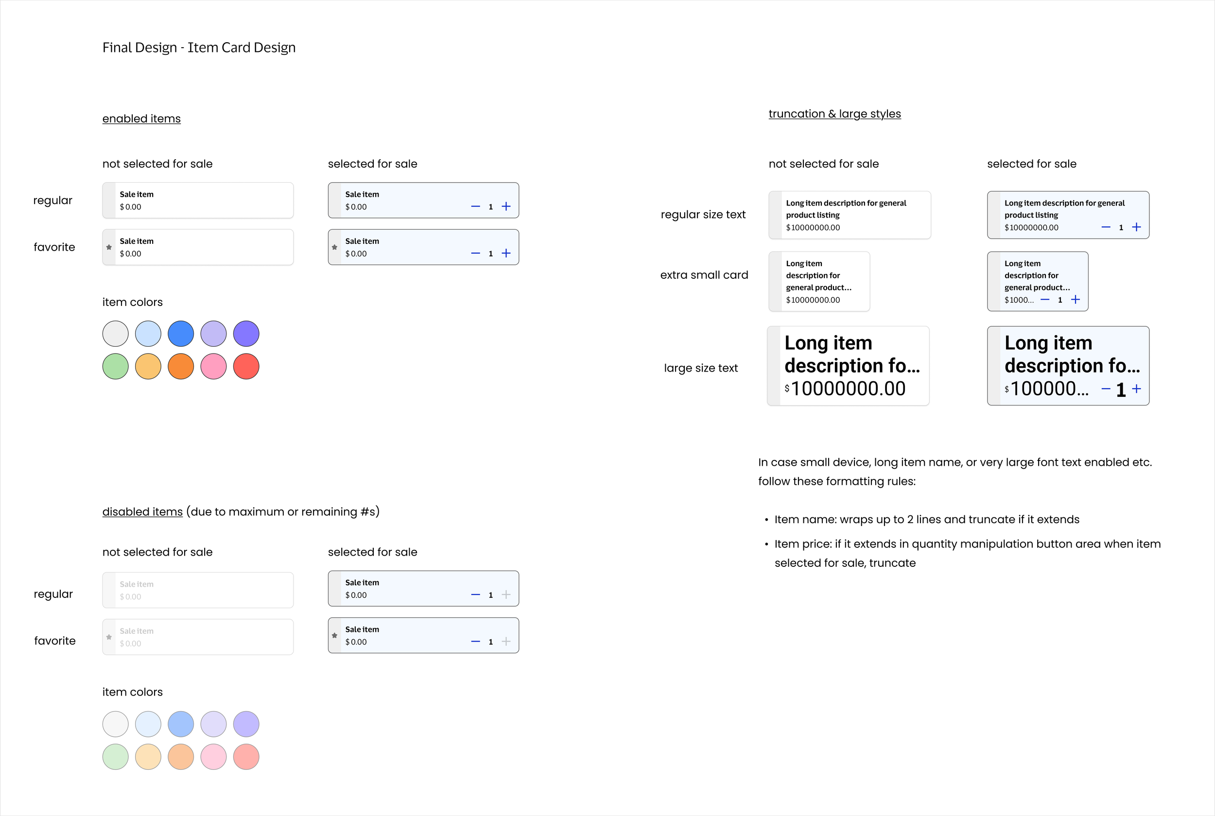
Item card design: Supports long currencies, accessible taps, and long item names.
One-tap add: Tap once to add an item, inspired by DoorDash and Square.
5. Saved Items
6. Optimizing for 3 Use Cases
After detailed pathway analysis and considering tradeoffs, I tailored the interactions and design to support the most common seller workflows.
Single Amount: Most sellers enter only one total amount. The “Accept Payment” button takes them straight to the Tap screen, streamlining checkout.
Saved Items: Sellers using saved items can add with one tap and intentionally proceed to checkout via the cart.
Saved Items + Amount: If a seller needs to add a missing amount while using saved items, switching to Amount mode lets them quickly add the outstanding value and move to checkout.
T H E S O L U T I O N
Optimized selling for both casual sellers and microsellers
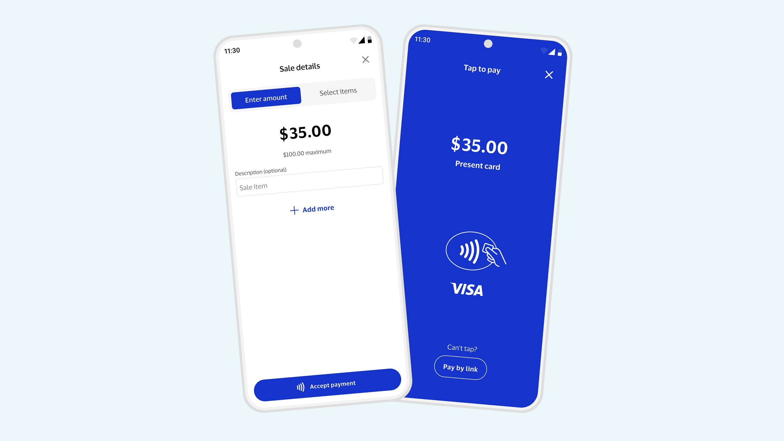
1 Amount Sale: consistent & quick
Streamlined flow: User enters the amount and can immediately accept payment.
In-context guidance: Usage limits are surfaced during the sale for clarity and understanding.
Optional “Add More”: Lets users add additional amounts without distracting from the primary checkout path.
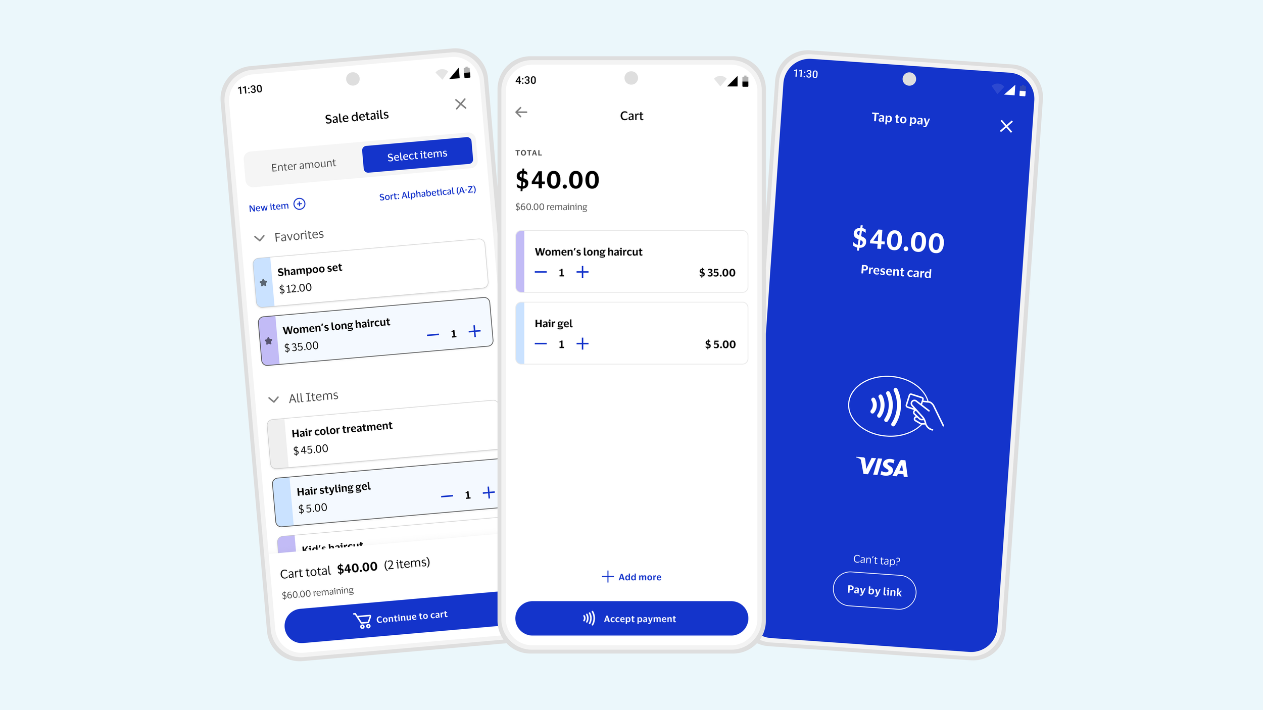
Saved Items Sale: intuitive & efficient
Thoughtful item cards: Designed to handle long currencies, accessible taps, and long item names.
One-tap add: Tap once to add an item, inspired by DoorDash and Square.
Dynamic feedback: Maximum amount updates to a remaining limit as items are added to the cart.
Intentional checkout: Sellers proceed to checkout intentionally via the primary button.
Mixed Sales: seamless
Flexible input: Toggle design supports adding to sale via amount entry and item selection
Optimized experience: Mode-specific pages keep interactions focused.
Clear cart distinction: entered amounts and items are distinct
C O N C L U S I O N
By addressing the needs of both microsellers with recurring items and casual sellers with occasional sales, I crafted a unique selling experience that balances simplicity, efficiency, and enjoyment.
Next Steps
November 2025: Design hand-off and development concluded.
January 2026: Visa Accept successfully launched. First commercial client, Sri Lankan Hatton National Bank, went live with ~2k active sellers and ~3k transaction within the first 20 days.
March 2026: 4 total clients live across 3 markets with ~5k onboarded sellers.
Ongoing: 30+ clients in pilot testing with upcoming releases planned.
Press Releases
Empowering Sri Lanka’s Micro-Merchants: Visa Introduces Game-Changing Acceptance Solution with Hatton National Bank (Lanka Monthly Digest - Visa Media Release, September 2025)
Empowering Sri Lanka’s Micro-Merchants: Visa Introduces Game-Changing Acceptance Solution with Hatton National Bank (Ada Derana Business, September 2025)
Autotrader // The Strategic Redesign
Visa Gen AI Hub // The Chatbot Builder